Enterprise AutoML Workflow Redesign
The configuration workflow for dotData's AutoML platform was technically correct but impossible to use. I redesigned it from a linear wizard into a canvas workspace — cutting setup time in half and letting business analysts run models without a data science team.
Role
Senior Product Designer
Product
dotData Enterprise AI Platform
Team
2 designers, 8 engineers
Focus
Workflow Design, Complex Systems UX

This project focused on redesigning how users configure AI models by making system dependencies and data alignment visible earlier in the workflow.
Problem Overview
The primary users were business analysts — people who understood their domain well but had limited hands-on experience with machine learning. Most of them were introduced to dotData by their organization, not by choice. Before the platform, many had relied on Excel or leaned on their data science team to run analyses.
That dependency didn't go away when dotData arrived. During configuration, analysts would typically work through settings in regular check-ins with a dotData data scientist — and in many cases, the DS would end up configuring the model on their behalf. The tool existed to give business users independence, but in practice, it still required expert support to operate.
The cost of a misconfiguration was hours. Model training could take one to two hours, depending on the data size. If a user sets the wrong data type, they'd have to re-upload the dataset and start over from scratch. If the model ran but accuracy came back low, they often had no idea why. Most of dotData's customers didn't have an internal data science team — that's exactly why they were using the platform. But every time something went wrong, they were filing it into our DS team's calendar. We were absorbing the cost of a UX problem as customer support hours.
Understand the system
Going into this project, the team assumed the problem was mostly terminology. To test this, an engineer asked me to configure a task using a real dataset without any help.
I couldn't do it.
This failure changed my entire approach. I began interviewing engineers and using ChatGPT to translate pipeline logic into plain language. As I built a mental model of the system, I realized terminology was just a symptom. The root cause was that we were building training datasets for prediction models, yet the interface offered zero visibility into the consequences of a user's choices. If they got it wrong, they wouldn't find out until the model finished running days later. The cost of a single mistake was too high.
Key Insights
Through this discovery process, I identified three structural flaws that were preventing users from succeeding:
Expert Trap
Although the interface was graphical, many concepts were still framed in data science terminology. A business analyst setting up their first model had no way to know what "prediction target time" meant or why getting it wrong would break everything downstream.
Invisible Ripple Effects
Configuration changes silently altered the dataset used for modeling, but users could not see these effects until the end of the process. By then, the only signal was a low accuracy score with no explanation attached.
Rigid Workflow
The step-based wizard forced users into a linear process, making experimentation slow and error-prone. If something went wrong, there was no way to adjust a single parameter. Users had to restart from the beginning.
From Wizard to Workspace
Initially, we explored optimizing the existing wizard with clearer labels and better navigation. However, the discovery process revealed a fundamental misalignment in mental models: the step-based wizard was forcing users to make a single, coherent decision through a sequence of isolated, disconnected steps.
I realized that the user's ultimate goal was to define a single flat table(the training dataset). Every parameter—from time columns to feature windows—was simply a variable determining that table's structure. By imposing a linear sequence, the interface was hiding the final output until it was too late to adjust.
That was the “Aha!” moment: If the task is constructing a dataset, the interface should make the construction logic visible in real-time. This insight led us to move away from the linear constraints and toward a canvas-based workspace that prioritizes visibility and relationship mapping.
Linear Wizard

Simpler navigation, but delays feedback about configuration mistakes. Users can't see how steps connect.
Pros: simpler navigation
Cons: delayed error discovery, hidden dependencies
Canvas Workspace
The blank canvas can feel unfamiliar at first, but returning users move through it quickly.
Pros: simpler navigation
Cons: delayed error discovery, hidden dependencies
Design Details: Turning Insights into Solutions
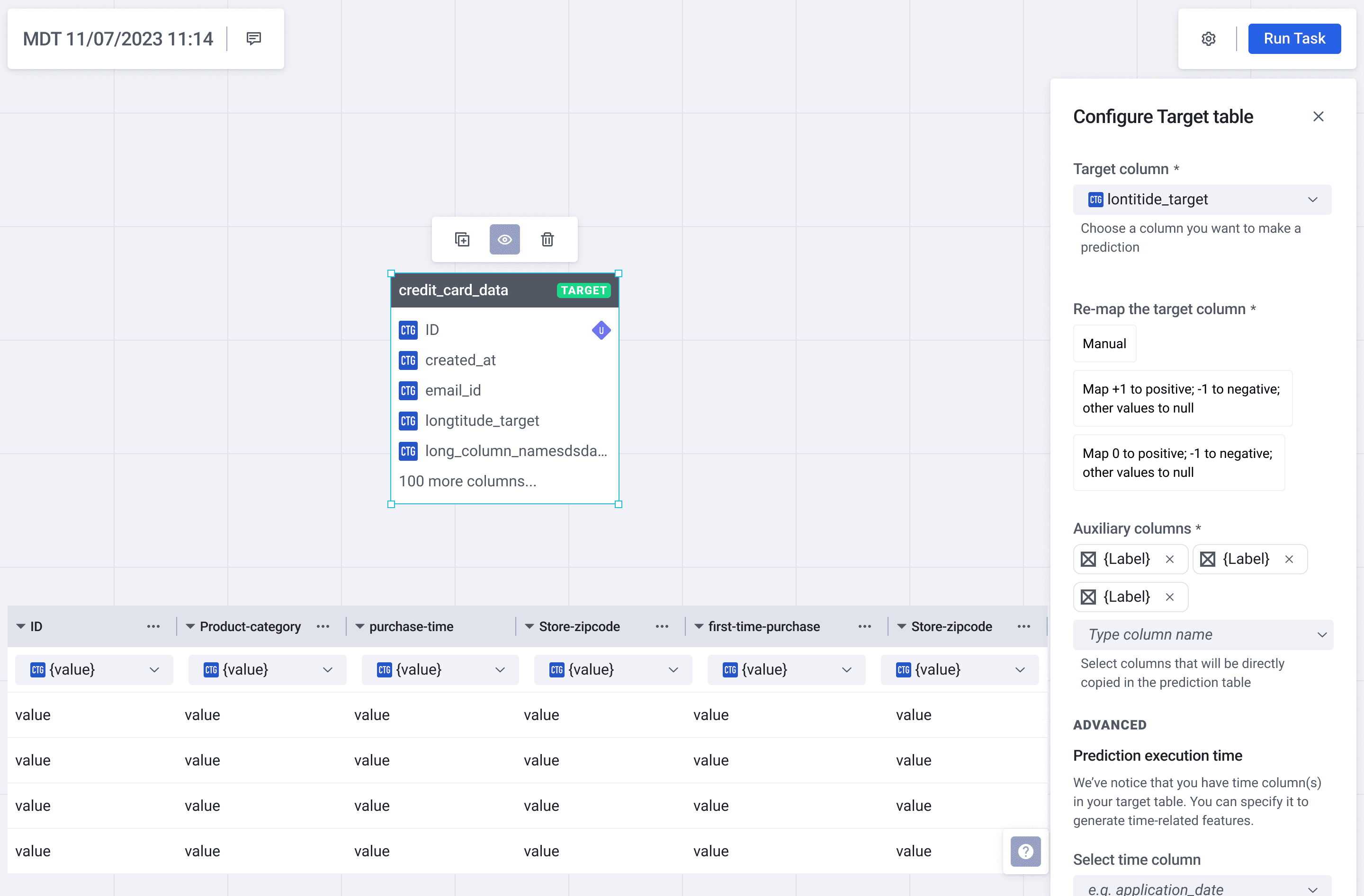
1. Contextual Configuration (The “Define Target” Panel)
The Insight: Solve the Rigid Workflow. In a linear wizard, making a change on Step 4 often meant restarting
from Step 1.
The Solution: We moved the configuration into a non-linear workspace. The “Define Target” panel now exists as a lightweight overlay on the canvas.
The Impact: Users can adjust critical parameters like “Prediction Target Time” inline without breaking their flow. To bridge the “Expert Trap,” I replaced static tooltips with interactive inline guidance, including a timeline visualization that allows users to see exactly how their time parameters affect the data window. This ensures technical terms are defined through action rather than just text.

2. Immediate Feedback (Real-time Table Exploration)
The Insight: Solve Invisible Ripple Effects. Since we couldn't technically preview the final combined dataset in real-time, I focused on making the “building blocks” transparent.
The Solution: I designed a “Cleansed View” drawer that allows users to instantly peek into any single table on the canvas.
The Impact: By showing data distributions and formats (Categorical, Datetime) immediately, users can verify their data quality before running the model. This creates an immediate feedback loop that catches simple errors in seconds.

3. Intelligent Default and Guardrails (Auto-Connect & Validation)
The Insight: Address the Expert Trap and the high cost of mistakes. Business analysts shouldn't need to be database engineers to connect tables correctly.
The Solution: We introduced Intelligent Auto-Connect, which suggests relationships based on schema matches. To back this up, I designed a Systemic Validation Panel that flags missing configurations or broken logic in real-time.
The Impact: Instead of waiting days for a model to fail, users get “actionable errors” immediately on the canvas. This transforms the debugging process from a 'waiting game' into a proactive check.


Validation
We tested the solution with Business Analytics students using a real-world server failure dataset. I focused on tracking behavior rather than feedback.
The “Non-Reader” Insight: Participants skipped every static description. This confirmed that user education is not a substitute for intuitive design. We couldn't explain the system to users; we had to let them experience the logic through interaction.
From Text to Interaction: One tester's struggle to connect static definitions to the configuration panel led directly to our interactive timeline visualization, turning a conceptual definition into a visual tool.
Imapct
50% Reduction in Setup Time:
Average configuration dropped from 10 to 5 minutes by removing linear bottlenecks.
Empowered Self-Service:
Transitioned from a model where Data Scientists were required for setup to a system where Business Analysts can complete tasks independently.
Immediate Error Recovery:
Smart defaults and inline validation eliminated “silent failures,” catching mistakes before any training costs were incurred.
Reflection
My initial assumption was that users just needed more information. I was wrong. The real challenge was deciding what to hide. Most of the design work was navigating that tension: providing enough signal to build confidence without creating noise that leads to second-guessing.
If I were to take this further, I would focus on closing the loop between configuration and performance. The gap between “setting up a table” and “understanding why a model succeeded” remains. Bridging that causal link is the next frontier for this product.
Beyond the canvas: Reimagining the experience with Agentic AI
If I were designing this system today, I would push past the “Workspace” model. While the canvas solved the visibility problem, it still assumed that users arrived with a clear, pre-defined use case. In reality, many analysts have the data but struggle to identify the most valuable problem to solve.
With the advent of Agentic AI, we can shift the user's role from “configuring a tool” to “collaborating with an expert.” I used Cursor to prototype a vision of how this system could evolve from a passive interface into a proactive partner.

1. From Form-First to Intent-Based Design
The original workspace assumed users already knew their target variables and model parameters. However, research revealed a major adoption hurdle: many analysts had the data but didn't know which predictive use cases were actually viable.
To solve this, I reimagined the start of the journey as a Consultative AI flow:
Data-Led Discovery: Instead of asking for configuration, the system first ingests the tables and performs automated cleansing. It then proactively suggests use cases (e.g., Holiday Impact Analysis) based on the patterns it detects in the data.
Explainable Recommendations: By showing users exactly why their data supports a specific goal (e.g., “IsHoliday flag present across all 143 weeks”), the system builds trust through transparency rather than just providing a “black box” suggestion.
Strategic Intent: By shifting from a “passive tool” to an “expert advisor,” the goal is to lower the barrier to entry and increase the activation rate for users who are new to predictive modeling, turning a technical hurdle into a guided strategic session.

2. Data Quality as a Dialogue, Not a Gate
In the original system, data errors often surfaced too late—sometimes only after hours of training. The reimagined flow treats data preparation as acontinuous, plain-language conversation.
The Shift: The system detects issues (such as missing values or inconsistent formats) immediately after upload. Instead of a technical error message, it explains the problem and offers actionable remedies with a clear “before and after” preview.
Strategic Intent: The goal is to transform a technical roadblock into an educational moment. By unblocking the user through guided resolution, we can reduce the reliance on Data Scientists and prevent “failed runs” from ever reaching the compute stage.
3. Strategic Sampling for Rapid Iteration
Enterprise-scale data makes iteration expensive. Waiting 20 minutes just to discover a configuration mistake is a fundamental failure in the feedback loop.
The Shift: I introduced a two-layer sampling strategy. The system uses a high-speed 10% sample for instant schema analysis and configuration validation. Once the logic is confirmed, the user can then commit the full compute for the actual model run.
Strategic Intent: By optimizing for the “Economy of Time,” this design intends to allow users to experiment and “fail fast” in seconds. This ensures that by the time the user hits “Run” on the full dataset, they have maximum confidence in their configuration.

Final Reflection
Looking back, the real design challenge wasn't just about making a “better UI”. It was about managing the tension between automation and control. As designers in the AI era, our job is changing. We are no longer just building boxes for people to fill; we are designing the guardrails for a partnership. While I'm proud of how the Canvas Workspace solved the immediate pain points of the legacy system, I believe the future lies in closing the gap between human intent and machine execution.